hi5 Networks Rebranding
The Challenge
When I started working at hi5 they were one of the most popular and heavily visited social networks worldwide. They had also just embarked on transitioning into a complete social gaming destination. Despite their success to that point, their visual identity and UI design was incredibly antiquated and incongruent with their push into gaming. The challenge was to design a new logo and UI pattern that clearly communicated that hi5 was a fun, hip, and modern platform for gaming.
My role: design.
The Starting Line
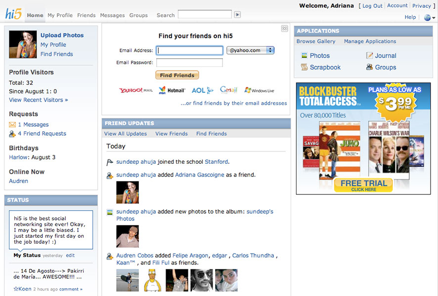
Clearly a very outdated design, and definatly not communicating the feeling of a fun and hip gaming company.
The Process
The logo started to take shape once I found the right 5 form. It was imperative that the 5 clearly read as a 5 and not the letter S. I knew I wanted a slab serif form as it would have the best legibility and gave a nod to the Vegas style slot machine numbers
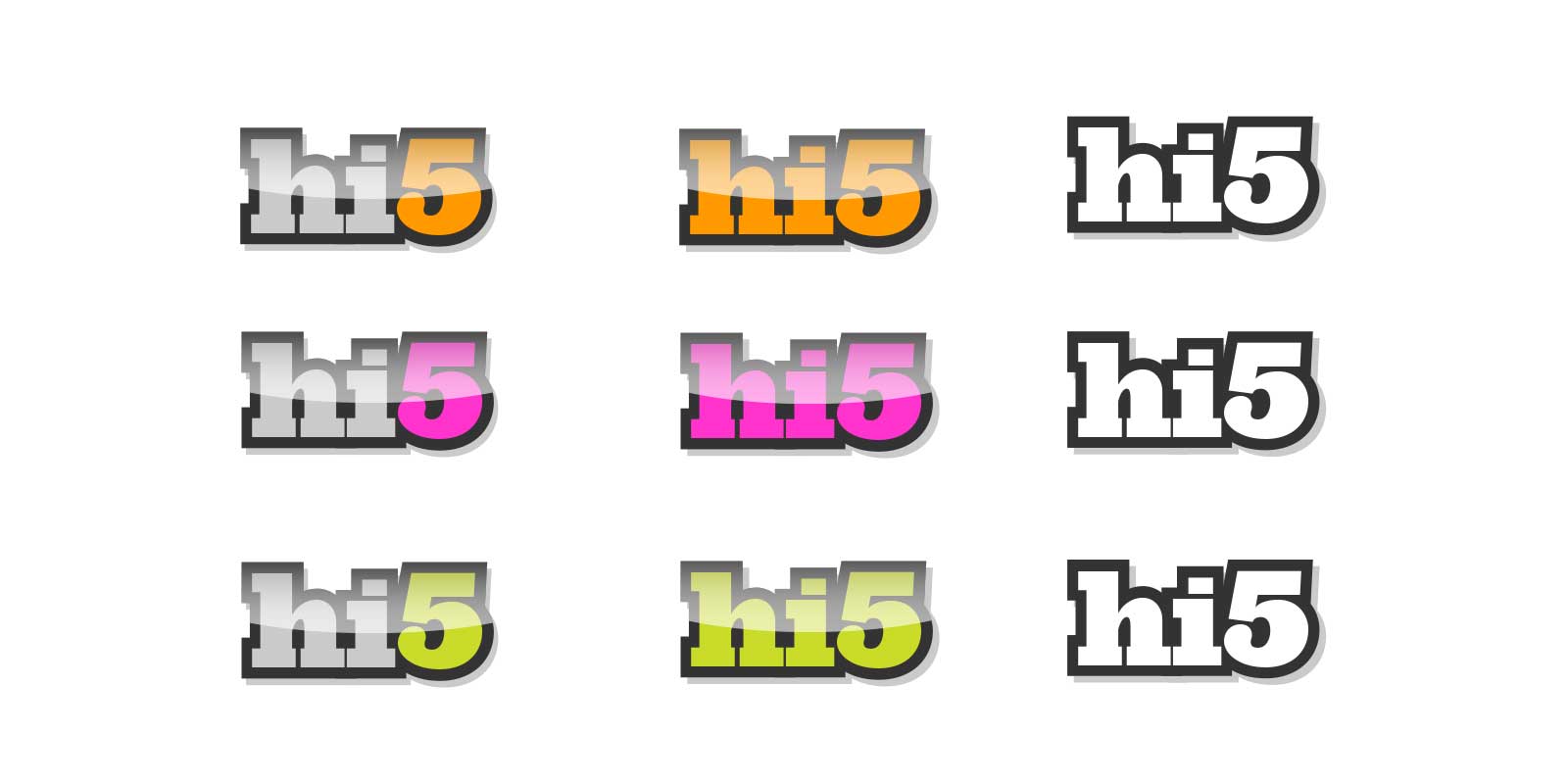
I experimented with many different highlight colors throughout the process. Focus group feedback helped us narrow down which options users responded best to. Orange was ultimately chosen as it had been a color historicaly used by hi5.
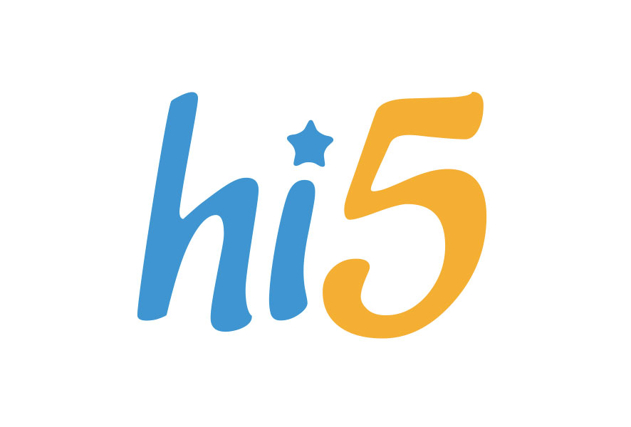
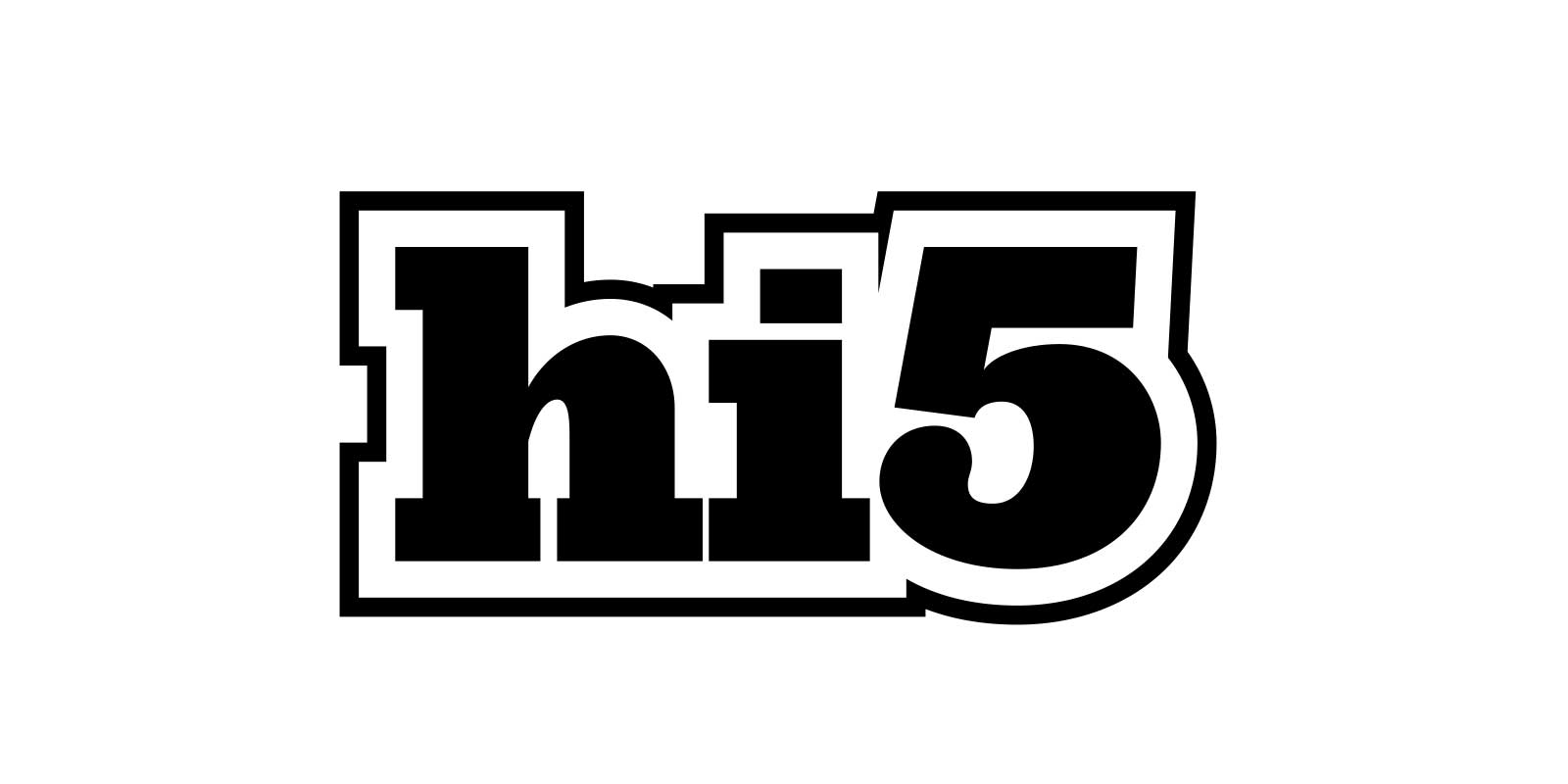
The Results
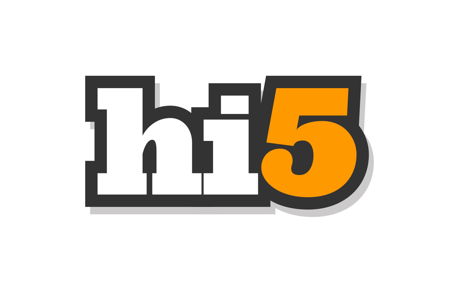
hi5 light, the new primary company logo.
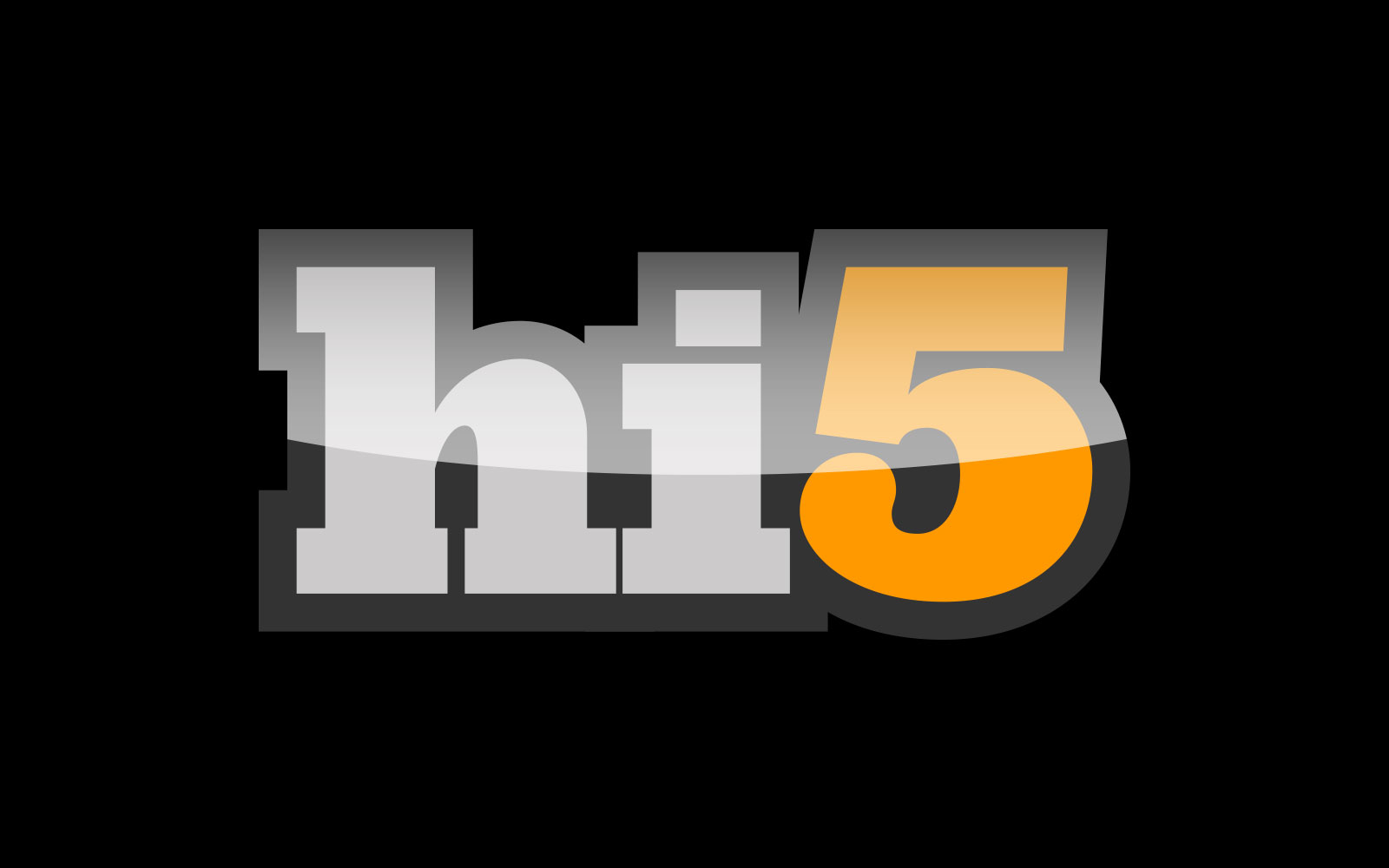
hi5 dark, the secondary logo.
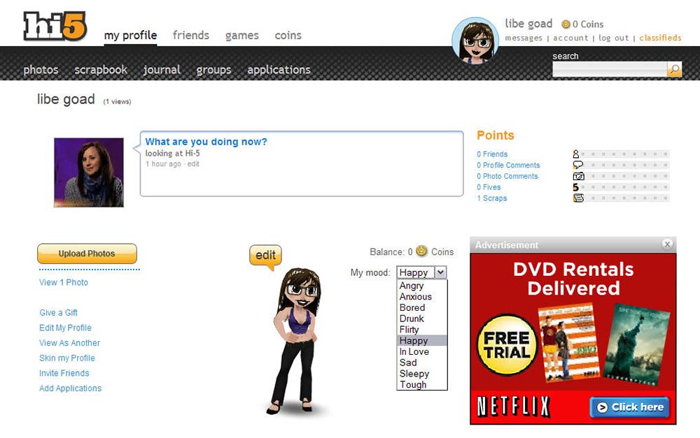
We incrementally made adjustments to simplify the site UI, starting with a new profile header and removing background gradients.
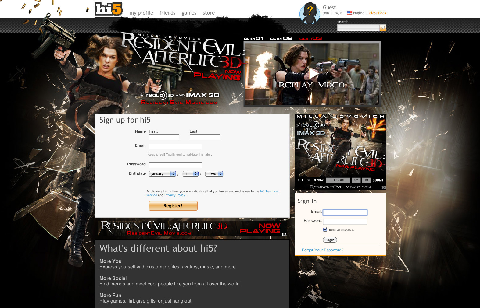
Logged-out homepage with our new header bar and an advertising takeover.