Credit Karma Email Design
The Challenge
The goal of these projects was to create a delightful and engaging experience for the user, that would quickly communicate a message, without deviating from our brand style. The message of each email varied anywhere from a simple account update, to a fraud alert, to a new product promotion. As such, the end-goal and success metrics for each campaign also varied greatly.
My role: design and animation.
The Process
After reviewing the project brief, I generally brainstormed ideas with a copywriter and marketing lead to be sure that all visuals would properly correspond with the subject lines and email copy. Once multiple visuals and copy variations were laid out, we reviewed everything for brand style and voice consistency, and mapped out the elements for AB testing. We worked with the constraints of often having to produce these emails very quickly and with limited ability to the change overall layout.
The Results
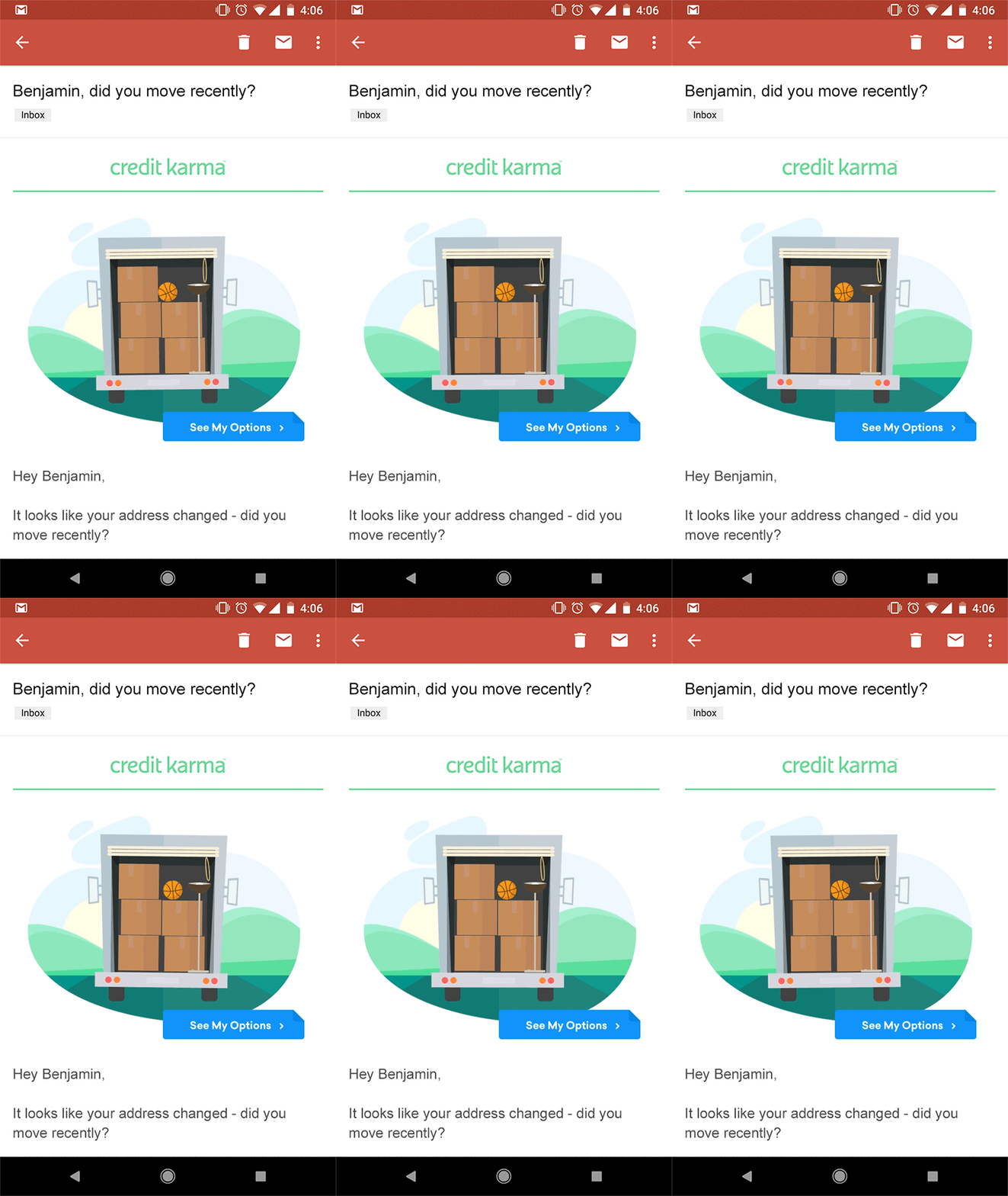
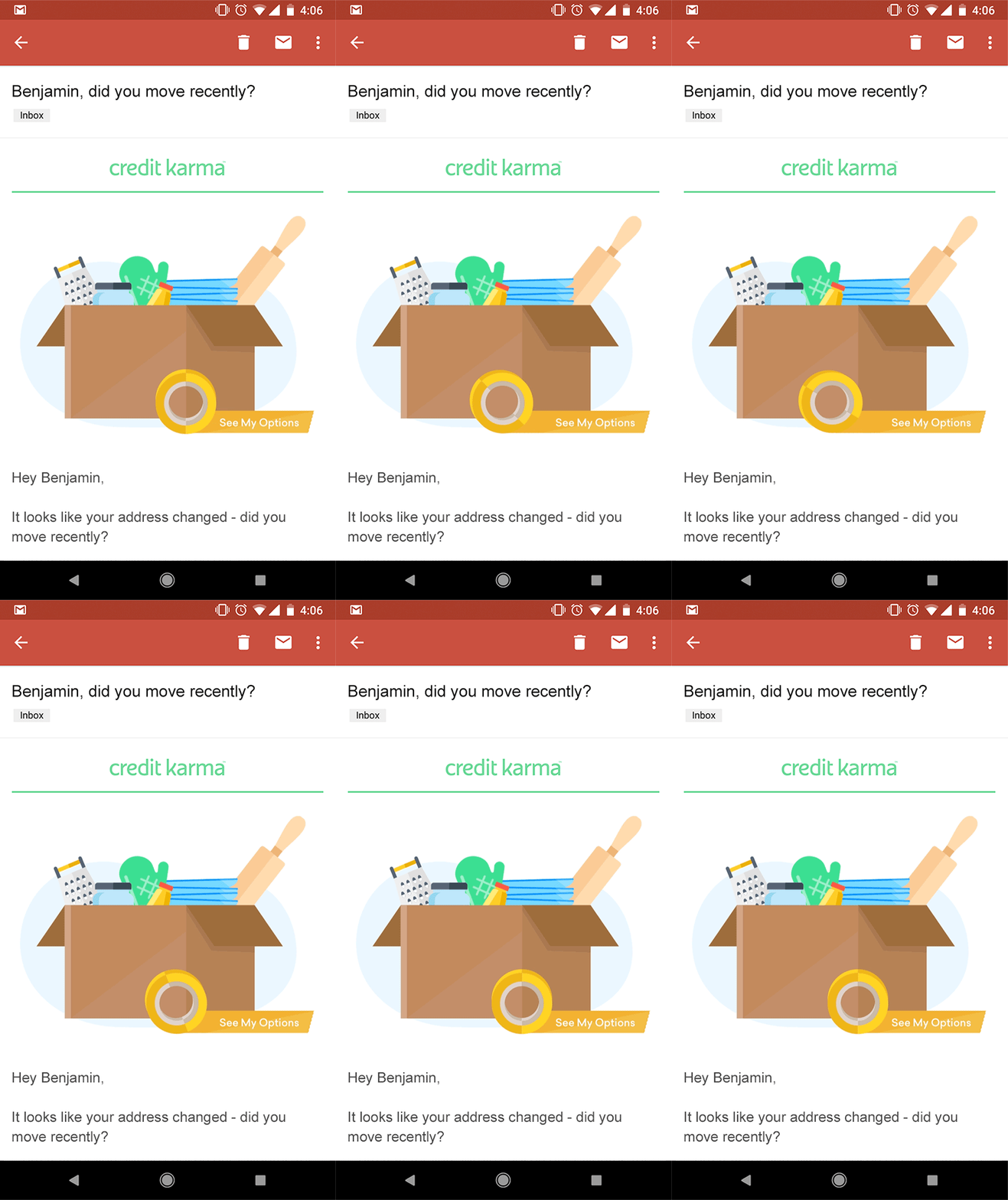
This email was sent out to users that had recently submitted a change of address form. It informed them about credit card benefits, and new products, that could benefit them during a move.
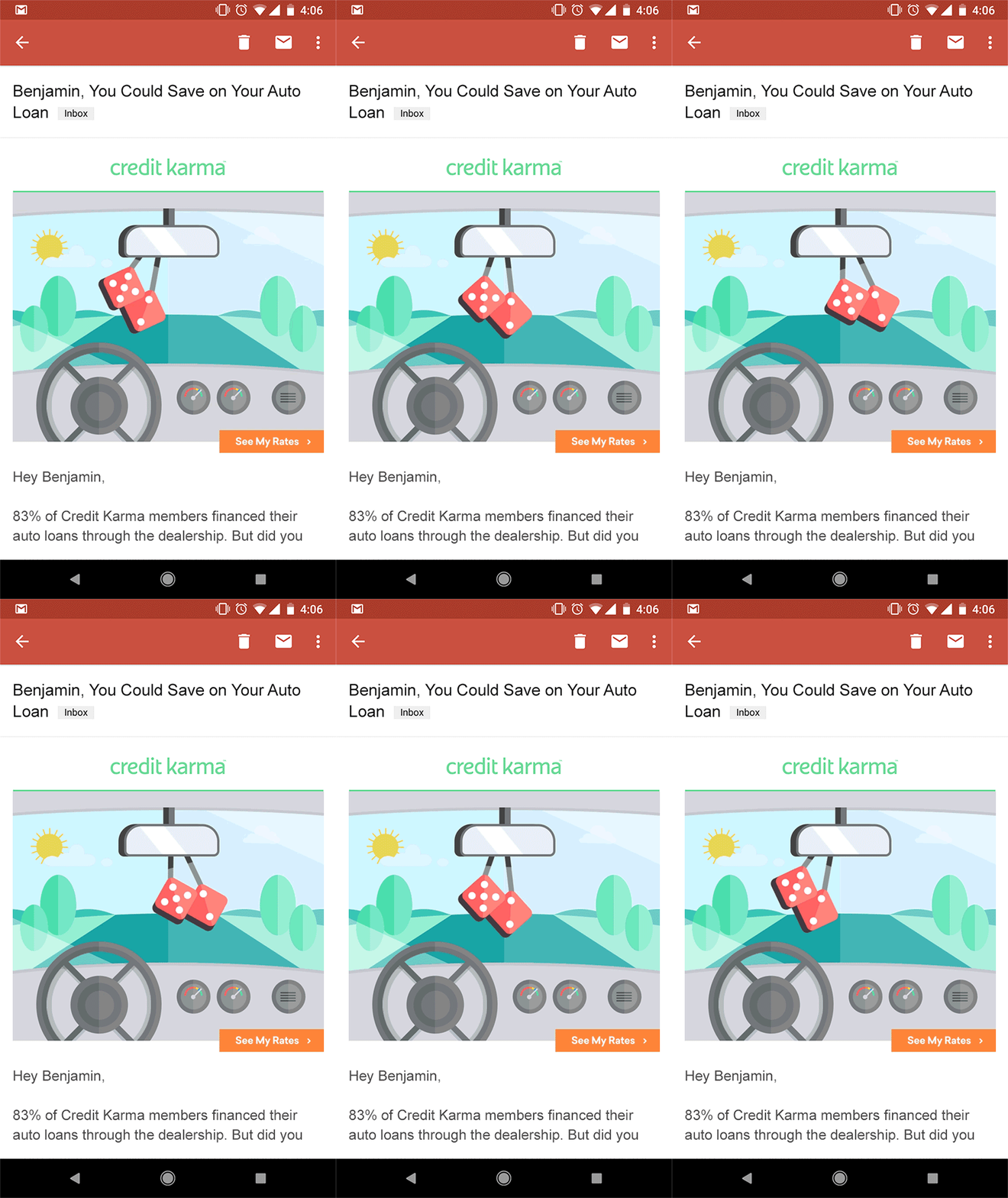
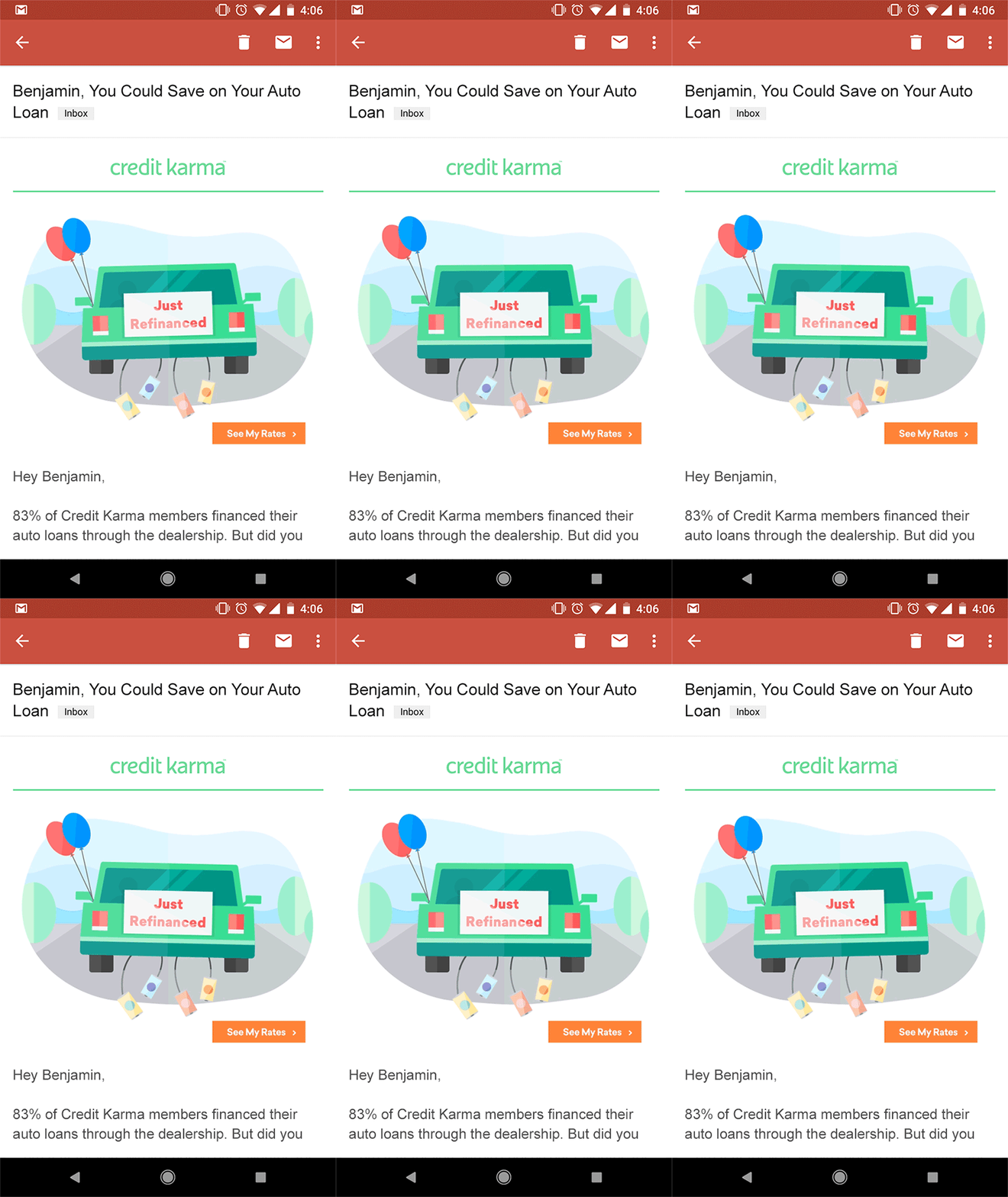
This email was sent out to users that had an auto loan that we determined they could be saving money on. It informed them about auto loan refinancing options, something most people don't know even exists.
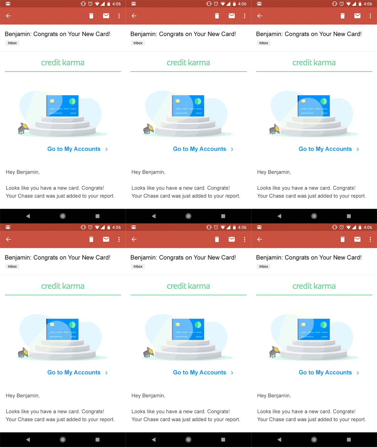
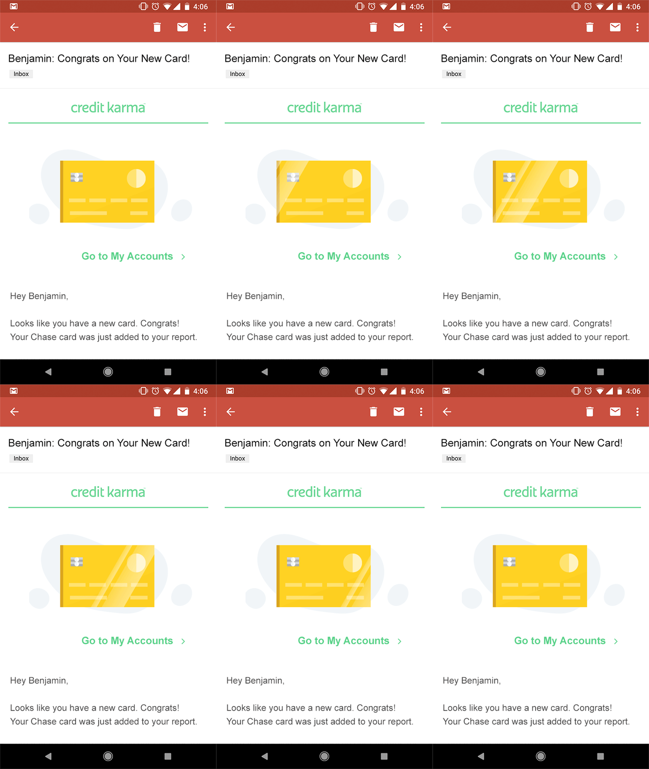
This email was sent out to users that had recently opened a new credit card. It informed them about card benefits they may not be aware of, and how they can be sure to make all their payments on time and avoid any late fee's or penalties.
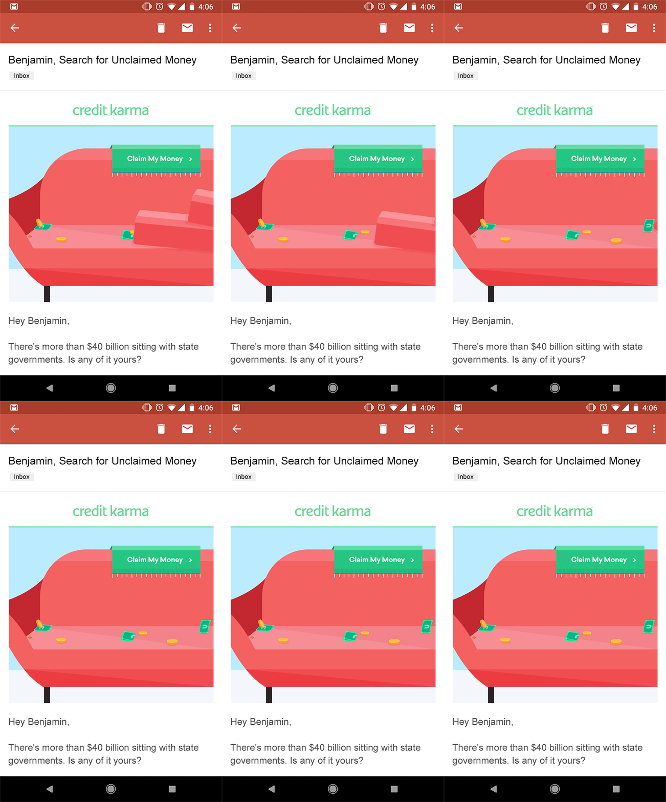
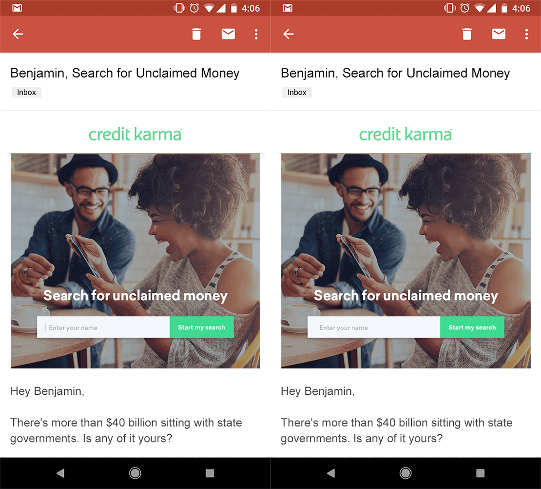
This email was sent out to inform users about our newest project - Unclaimed Money. It allows users to check their names against government databases of money that is unknowingly owed to people and ready to be collected. If they find a match, it guides them in collecting the funds..