Credit Karma Careers Section
The Challenge
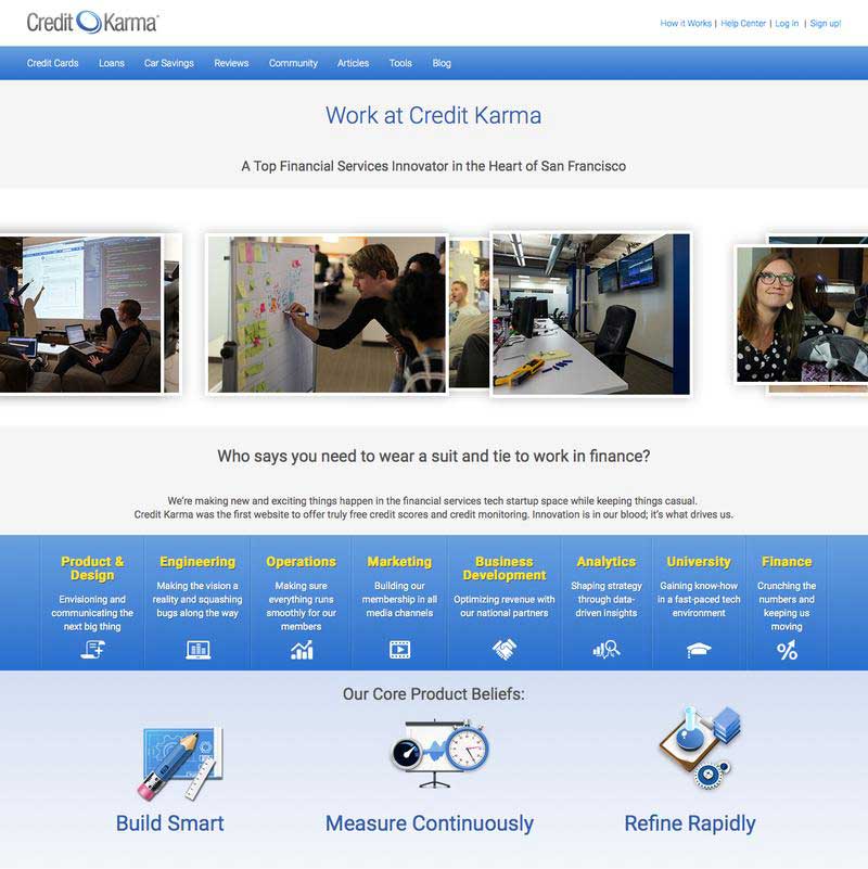
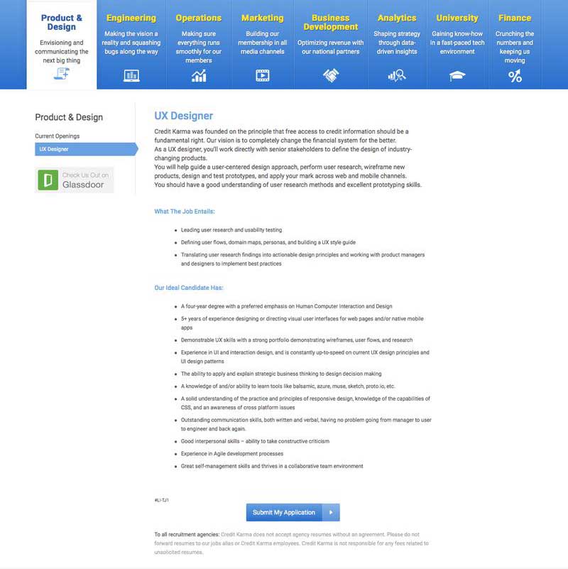
When I started with Credit Karma, they were rapidly scaling in size and had very ambitious hiring goals. The careers section of their website was very outdated and difficult to navigate through. Since it would be most candidates first point of contact with the company, it was imperative that they received a positive first impression. The challenge was to redesign this section of the homepage to present the best qualities of the company and make the job listings easily accessible.
My role: design and hand-off to front-end.
The Starting Line


Very outdated design, not responsive, and difficult to navigate through.
The Process
Before diving into any design work, I started with interviewing a few of the employees recently hired at the company to get a better insight into the things they found most important in a careers section. This helped inform which sections to emphasize, and the overall tone and message. I collaborated closely with a copywriter and members of the recruiting team to decide on exactly what messaging and kind of images we wanted to use. I then built out wireframes for the pages, and after a bit of fine-tuning and adjustments, the last step was the visual design and final section of images.
The Results

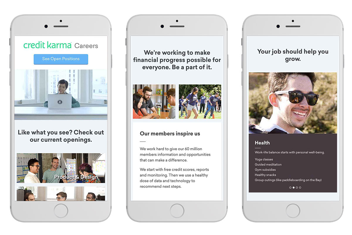
Careers landing page

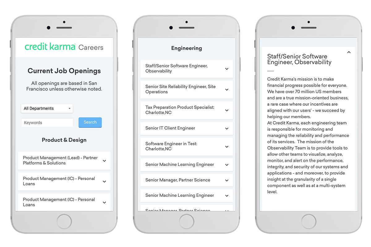
Open positions page

In mobile view, the departments list is pushed to the top of the page.
